Please Note: This article is written for users of the following Microsoft Word versions: 97, 2000, 2002, and 2003. If you are using a later version (Word 2007 or later), this tip may not work for you. For a version of this tip written specifically for later versions of Word, click here: Turning Off Borders for Data Series.
When Microsoft Graph normally charts your data, it surrounds the graphical representation of that data with a border. This is typically a black line, but you can turn off this border, if you so desire. To do this, follow these steps:
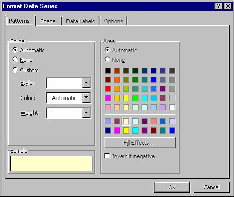
Figure 1. The Format Data Series dialog box
WordTips is your source for cost-effective Microsoft Word training. (Microsoft Word is the most popular word processing software in the world.) This tip (717) applies to Microsoft Word 97, 2000, 2002, and 2003. You can find a version of this tip for the ribbon interface of Word (Word 2007 and later) here: Turning Off Borders for Data Series.

Learning Made Easy! Quickly teach yourself how to format, publish, and share your content using Word 2021 or Microsoft 365. With Step by Step, you set the pace, building and practicing the skills you need, just when you need them! Check out Microsoft Word Step by Step today!
Microsoft Chart uses text to label items in a chart. Here's how to change the font used for that text.
Discover MoreHow to remove information from your datasheet.
Discover MoreMicrosoft Graph provides a handy way to add simple charts to your document without the need for Excel. Those charts are ...
Discover MoreFREE SERVICE: Get tips like this every week in WordTips, a free productivity newsletter. Enter your address and click "Subscribe."
There are currently no comments for this tip. (Be the first to leave your comment—just use the simple form above!)
Got a version of Word that uses the menu interface (Word 97, Word 2000, Word 2002, or Word 2003)? This site is for you! If you use a later version of Word, visit our WordTips site focusing on the ribbon interface.
Visit the WordTips channel on YouTube

FREE SERVICE: Get tips like this every week in WordTips, a free productivity newsletter. Enter your address and click "Subscribe."
Copyright © 2026 Sharon Parq Associates, Inc.
 Please Note:
This article is written for users of the following Microsoft Word versions: 97, 2000, 2002, and 2003. If you are using a later version (Word 2007 or later), this tip may not work for you. For a version of this tip written specifically for later versions of Word, click here:
Please Note:
This article is written for users of the following Microsoft Word versions: 97, 2000, 2002, and 2003. If you are using a later version (Word 2007 or later), this tip may not work for you. For a version of this tip written specifically for later versions of Word, click here:
Comments