When Microsoft Graph charts your data, it normally surrounds the graphical representation of that data with a border. This is typically a thin black line, but you can change both the line color and line weight used to create this border. To do this, follow these steps:
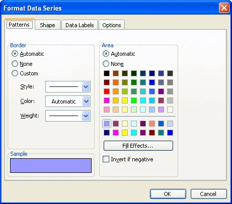
Figure 1. The Patterns tab of the Format Data Series dialog box.
WordTips is your source for cost-effective Microsoft Word training. (Microsoft Word is the most popular word processing software in the world.) This tip (718) applies to Microsoft Word 97, 2000, 2002, and 2003.

Do More in Less Time! An easy-to-understand guide to the more advanced features available in the Microsoft 365 version of Word. Enhance the quality of your documents and boost productivity in any field with this in-depth resource. Complete your Word-related tasks more efficiently as you unlock lesser-known tools and learn to quickly access the features you need. Check out Microsoft 365 Word For Professionals For Dummies today!
Microsoft Chart is a handy program that allows you to display numbers and charts without the need for Excel. If you need ...
Discover MoreControlling which datasheet information is graphed in a chart.
Discover MoreWhen you create a chart in Microsoft Graph, you might now want to see one or both of the axes included by default. Here's ...
Discover MoreFREE SERVICE: Get tips like this every week in WordTips, a free productivity newsletter. Enter your address and click "Subscribe."
There are currently no comments for this tip. (Be the first to leave your comment—just use the simple form above!)
Got a version of Word that uses the menu interface (Word 97, Word 2000, Word 2002, or Word 2003)? This site is for you! If you use a later version of Word, visit our WordTips site focusing on the ribbon interface.
Visit the WordTips channel on YouTube

FREE SERVICE: Get tips like this every week in WordTips, a free productivity newsletter. Enter your address and click "Subscribe."
Copyright © 2026 Sharon Parq Associates, Inc.
Comments