As Microsoft Graph displays your data in a graphic format, it automatically selects colors for each of the data series (rows of data) it charts. The palette from which you can select your colors consists of 56 choices. To change colors, follow these steps:
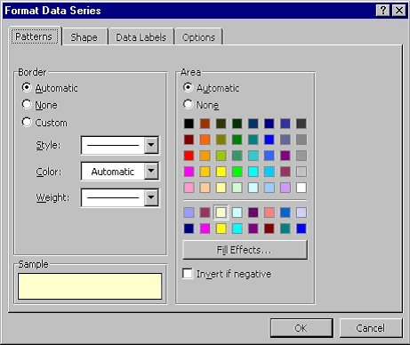
Figure 1. The Format Data Series dialog box
WordTips is your source for cost-effective Microsoft Word training. (Microsoft Word is the most popular word processing software in the world.) This tip (685) applies to Microsoft Word 97, 2000, 2002, and 2003.
Discover the Power of Microsoft Office This beginner-friendly guide reveals the expert tips and strategies you need to skyrocket your productivity and use Office 365 like a pro. Mastering software like Word, Excel, and PowerPoint is essential to be more efficient and advance your career. Simple lessons guide you through every step, providing the knowledge you need to get started. Check out Microsoft Office 365 For Beginners today!
If you don't have Excel installed on your system, Microsoft Graph is a handy way to create simple charts for your ...
Discover MoreMicrosoft Graph is a handy way to add charts to your document if you don't have access to Excel. Here's how to adjust the ...
Discover MoreData labels can help identify data in a chart. Here's how to add data labels.
Discover MoreFREE SERVICE: Get tips like this every week in WordTips, a free productivity newsletter. Enter your address and click "Subscribe."
There are currently no comments for this tip. (Be the first to leave your comment—just use the simple form above!)
Got a version of Word that uses the menu interface (Word 97, Word 2000, Word 2002, or Word 2003)? This site is for you! If you use a later version of Word, visit our WordTips site focusing on the ribbon interface.
Visit the WordTips channel on YouTube

FREE SERVICE: Get tips like this every week in WordTips, a free productivity newsletter. Enter your address and click "Subscribe."
Copyright © 2026 Sharon Parq Associates, Inc.
Comments