Editing the Color Palette in Chart

Written by Allen Wyatt (last updated November 4, 2019)
This tip applies to Word 97, 2000, 2002, and 2003


Microsoft Graph allows you to create full-color charts based on any the colors contained in a palette. If you desire, you can modify the colors in the palette. This is done in the following manner:

  1. Choose Options from the Tools menu. Microsoft Graph displays the Graph Options dialog box.
  2. Make sure the Color tab is selected. (See Figure 1.)
  3. Figure 1. The Color tab of the Graph Options dialog box

  4. Select the color you wish to change by clicking on it.
  5. Click on Modify. Microsoft Graph displays the Colors dialog box. (See Figure 2.)
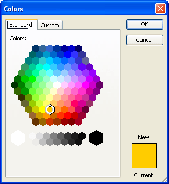
  6. Figure 2. The Colors dialog box.

  7. Change the color by clicking in the color chooser (the large color matrix).
  8. When you have selected the color desired, click on OK.
  9. Click OK again in the Graph Options dialog box. Your changed color is now available to use in your chart.

WordTips is your source for cost-effective Microsoft Word training. (Microsoft Word is the most popular word processing software in the world.) This tip (686) applies to Microsoft Word 97, 2000, 2002, and 2003.

Author Bio

Allen Wyatt

With more than 50 non-fiction books and numerous magazine articles to his credit, Allen Wyatt is an internationally recognized author. He is president of Sharon Parq Associates, a computer and publishing services company. ...

MORE FROM ALLEN

Locking Callouts to a Graph Location

If you add callouts using the drawing tools in Excel, you may have noticed that they don't always stay where you expect ...

Discover More

Understanding Manual Calculation

When you make changes in a worksheet, Excel automatically recalculates everything that may be affected by that change. If ...

Discover More

Watermarks in Excel

Excel is great at printing numbers on a piece of paper, but terrible at printing watermarks. This is apparently by ...

Discover More

The First and Last Word on Word! Bestselling For Dummies author Dan Gookin puts his usual fun and friendly candor back to work to show you how to navigate Word 2013. Spend more time working and less time trying to figure it all out! Check out Word 2013 For Dummies today!

More WordTips (menu)

Selecting Text Orientation for an Axis in Microsoft Graph

Microsoft Graph allows you to easily create charts from numeric data, without the need to use Excel. This tip explains ...

Discover More

Adding a Border Around Text in a Chart

You can included text in your charts, and even place a border around the text.

Discover More

Selecting Fonts for a Chart

Microsoft Chart uses text to label items in a chart. Here's how to change the font used for that text.

Discover More
Subscribe

FREE SERVICE: Get tips like this every week in WordTips, a free productivity newsletter. Enter your address and click "Subscribe."

View most recent newsletter.

Comments

If you would like to add an image to your comment (not an avatar, but an image to help in making the point of your comment), include the characters [{fig}] (all 7 characters, in the sequence shown) in your comment text. You’ll be prompted to upload your image when you submit the comment. Maximum image size is 6Mpixels. Images larger than 600px wide or 1000px tall will be reduced. Up to three images may be included in a comment. All images are subject to review. Commenting privileges may be curtailed if inappropriate images are posted.

What is 7 - 7?

There are currently no comments for this tip. (Be the first to leave your comment—just use the simple form above!)


This Site

Got a version of Word that uses the menu interface (Word 97, Word 2000, Word 2002, or Word 2003)? This site is for you! If you use a later version of Word, visit our WordTips site focusing on the ribbon interface.

Videos
Subscribe

FREE SERVICE: Get tips like this every week in WordTips, a free productivity newsletter. Enter your address and click "Subscribe."

(Your e-mail address is not shared with anyone, ever.)

View the most recent newsletter.