Controlling the Display of Chart Axes in Microsoft Graph

Written by Allen Wyatt (last updated January 11, 2025)
This tip applies to Word 97, 2000, 2002, and 2003


Depending on the type of chart you are developing in Microsoft Graph, your graph can have two or three axes. (XY or XZ for two-dimensional charts, and XYZ for three-dimensional.) If you are using a pie chart, there are no axes at all. If your chart uses axes, Microsoft Graph lets you control whether a certain axis is displayed. You do this as follows:

  1. Select Chart Options from the Chart menu. Microsoft Graph displays the Chart Options dialog box.
  2. Make sure the Axes tab is selected. (See Figure 1.)
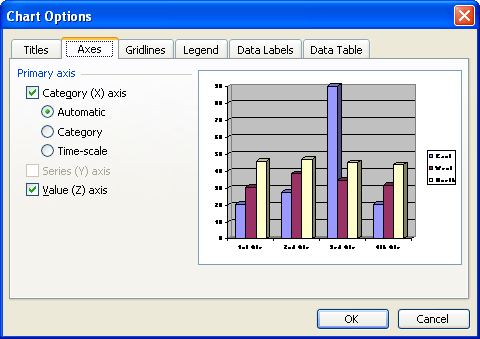
  3. Figure 1. The Axes tab of the Chart Options dialog box

  4. Click on the check box for the axis you want to affect. For instance, click on the X axis if you want to turn it on or off. A check mark in the check box for an axis means it will be displayed.
  5. Click on OK.

WordTips is your source for cost-effective Microsoft Word training. (Microsoft Word is the most popular word processing software in the world.) This tip (705) applies to Microsoft Word 97, 2000, 2002, and 2003.

Author Bio

Allen Wyatt

With more than 50 non-fiction books and numerous magazine articles to his credit, Allen Wyatt is an internationally recognized author. He is president of Sharon Parq Associates, a computer and publishing services company. ...

MORE FROM ALLEN

AutoText Unavailable in Headers and Footers

When you are creating headers and footers for your document, you might want to use some of your AutoText entries. What if ...

Discover More

Inserting Summary Information

Want to insert into your document those snippets of information that you know Word maintains about your document? It's ...

Discover More

Viewing Your Document Full-Screen

Want to see the absolute most of your document that you can? Then you need to become familiar with the full-screen ...

Discover More

The First and Last Word on Word! Bestselling For Dummies author Dan Gookin puts his usual fun and friendly candor back to work to show you how to navigate Word 2019. Spend more time working and less time trying to figure it all out! Check out Word 2019 For Dummies today!

More WordTips (menu)

Turning Off Borders for Data Series

Don't want a border to appear around a data series represented in a Microsoft Graph chart? You can easily control the ...

Discover More

Changing Datasheet Column Width

To see information in a datasheet better, you may need to adjust column width.

Discover More

Displaying a Chart Legend

A legend can help explain the various lines or objects visible in a chart. Microsoft Chart allows you to turn on or off ...

Discover More
Subscribe

FREE SERVICE: Get tips like this every week in WordTips, a free productivity newsletter. Enter your address and click "Subscribe."

View most recent newsletter.

Comments

If you would like to add an image to your comment (not an avatar, but an image to help in making the point of your comment), include the characters [{fig}] (all 7 characters, in the sequence shown) in your comment text. You’ll be prompted to upload your image when you submit the comment. Maximum image size is 6Mpixels. Images larger than 600px wide or 1000px tall will be reduced. Up to three images may be included in a comment. All images are subject to review. Commenting privileges may be curtailed if inappropriate images are posted.

What is nine less than 9?

There are currently no comments for this tip. (Be the first to leave your comment—just use the simple form above!)


This Site

Got a version of Word that uses the menu interface (Word 97, Word 2000, Word 2002, or Word 2003)? This site is for you! If you use a later version of Word, visit our WordTips site focusing on the ribbon interface.

Videos
Subscribe

FREE SERVICE: Get tips like this every week in WordTips, a free productivity newsletter. Enter your address and click "Subscribe."

(Your e-mail address is not shared with anyone, ever.)

View the most recent newsletter.