Often the information presented on a graph axis will be numeric. For instance, an axis may show numbers that represent the magnitude of what is being charted. Microsoft Graph allows you complete control over how numbers appear in your axes. You can control the appearance in the following manner:
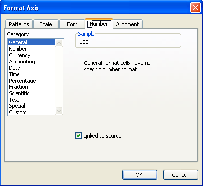
Figure 1. The Number tab of the Format Axis dialog box
WordTips is your source for cost-effective Microsoft Word training. (Microsoft Word is the most popular word processing software in the world.) This tip (711) applies to Microsoft Word 97, 2000, 2002, and 2003.

Do More in Less Time! An easy-to-understand guide to the more advanced features available in the Microsoft 365 version of Word. Enhance the quality of your documents and boost productivity in any field with this in-depth resource. Complete your Word-related tasks more efficiently as you unlock lesser-known tools and learn to quickly access the features you need. Check out Microsoft 365 Word For Professionals For Dummies today!
Microsoft Chart is a handy program that allows you to display numbers and charts without the need for Excel. If you need ...
Discover MoreControlling which datasheet information is graphed in a chart.
Discover MoreMicrosoft Graph can be a handy way to add quick and dirty charts to your document. When working with 3-D charts, you can ...
Discover MoreFREE SERVICE: Get tips like this every week in WordTips, a free productivity newsletter. Enter your address and click "Subscribe."
There are currently no comments for this tip. (Be the first to leave your comment—just use the simple form above!)
Got a version of Word that uses the menu interface (Word 97, Word 2000, Word 2002, or Word 2003)? This site is for you! If you use a later version of Word, visit our WordTips site focusing on the ribbon interface.
Visit the WordTips channel on YouTube

FREE SERVICE: Get tips like this every week in WordTips, a free productivity newsletter. Enter your address and click "Subscribe."
Copyright © 2026 Sharon Parq Associates, Inc.
Comments