Please Note: This article is written for users of the following Microsoft Word versions: 97, 2000, 2002, and 2003. If you are using a later version (Word 2007 or later), this tip may not work for you. For a version of this tip written specifically for later versions of Word, click here: Changing Kerning.
When a font is designed, a certain amount of space is designated for inter-character spacing. This spacing determines how close adjacent characters are to each other. Unfortunately, not all characters appear the same width when read on a printed page. Depending on the characters, this can cause an illusion that two characters are spaced too far apart, when in reality they follow the standard spacing conventions for the typeface. This problem normally appears when the left character in a pair has a stroke (a line) that travels diagonally from left to right.
Kerning is a typographical term describing the process of moving letters closer together, in an effort to overcome the illusion of too much space between letters. This makes the text both more appealing and more readable. In Word, kerning can be adjusted either automatically or manually. To change kerning automatically, perform the following steps:
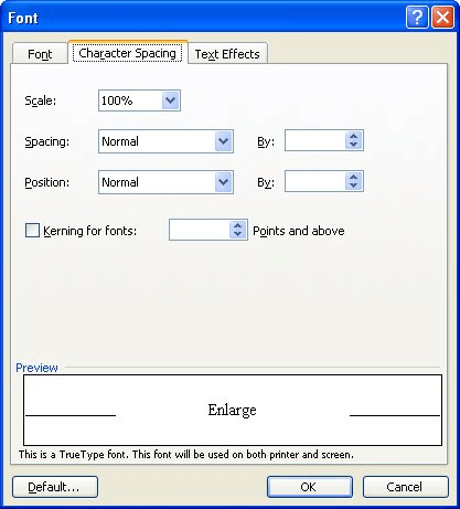
Figure 1. The Character Spacing tab of the Font dialog box.
In most cases, this type of kerning will be acceptable. There may be instances, however, when you want to manually adjust the kerning between two characters. For instance, you might want to create some special effect for the characters. In these cases, you can manually adjust kerning by following these steps:
WordTips is your source for cost-effective Microsoft Word training. (Microsoft Word is the most popular word processing software in the world.) This tip (1130) applies to Microsoft Word 97, 2000, 2002, and 2003. You can find a version of this tip for the ribbon interface of Word (Word 2007 and later) here: Changing Kerning.
The First and Last Word on Word! Bestselling For Dummies author Dan Gookin puts his usual fun and friendly candor back to work to show you how to navigate Word 2019. Spend more time working and less time trying to figure it all out! Check out Word 2019 For Dummies today!
If you need to remove any explicit character formatting from some text, you'll want to commit the shortcut in this tip to ...
Discover MoreWhen Word creates an automatically numbered list, it removes some of your formatting flexibility. One thing you can't ...
Discover MoreFormatting some of your text as hidden can be a great help when you need to keep some things from being viewed or ...
Discover MoreFREE SERVICE: Get tips like this every week in WordTips, a free productivity newsletter. Enter your address and click "Subscribe."
There are currently no comments for this tip. (Be the first to leave your comment—just use the simple form above!)
Got a version of Word that uses the menu interface (Word 97, Word 2000, Word 2002, or Word 2003)? This site is for you! If you use a later version of Word, visit our WordTips site focusing on the ribbon interface.
Visit the WordTips channel on YouTube

FREE SERVICE: Get tips like this every week in WordTips, a free productivity newsletter. Enter your address and click "Subscribe."
Copyright © 2026 Sharon Parq Associates, Inc.
 Please Note:
This article is written for users of the following Microsoft Word versions: 97, 2000, 2002, and 2003. If you are using a later version (Word 2007 or later), this tip may not work for you. For a version of this tip written specifically for later versions of Word, click here:
Please Note:
This article is written for users of the following Microsoft Word versions: 97, 2000, 2002, and 2003. If you are using a later version (Word 2007 or later), this tip may not work for you. For a version of this tip written specifically for later versions of Word, click here:
Comments