Please Note: This article is written for users of the following Microsoft Word versions: 97, 2000, 2002, and 2003. If you are using a later version (Word 2007 or later), this tip may not work for you. For a version of this tip written specifically for later versions of Word, click here: Getting Rid of Choppiness in Justified Text.
Written by Allen Wyatt (last updated October 14, 2021)
This tip applies to Word 97, 2000, 2002, and 2003
Depending on the characteristics of the text in your document, you might notice that justifying a paragraph (Format | Paragraph | Alignment: Justified) may not produce the best looking results. This is because when you choose to justify a paragraph, Word expands the text on each line by adding space between words and letters. This may not always give the best-looking results, and you may need to make adjustments to get better-looking text.
There are many options you can try, and you should become familiar with all of them so that you can try them out on your text. The first guideline is to check your text; there may be some things you can do to it that will allow cleaner flowing through a paragraph:
With your text in shape, you can then begin actual formatting. One approach is to choose Format | Font | Character Spacing tab and set the Scale control to 95%. If that does not provide better spacing, scale it down to 90%. These adjustments are typically so slight (particularly with commonly used font sizes for body text) that readers won't notice, but the effect on text flow could be dramatic—particularly in long paragraphs.
Perhaps the best solution, however, is to completely change the algorithm that Word uses to justify text. Many people prefer the algorithm used in WordPerfect, so Microsoft added the ability to emulate that justification method—resulting in much less choppiness. You can adjust the setting by following these steps:
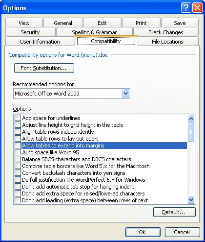
Figure 1. The Compatibility tab of the Options dialog box.
This will change the way justification is handled, but only for the current document. If you clicked the Default button, then the change is made in the Normal.dot template, provided you choose to save changes to the template when you exit Word. With the change made in the template, then all future documents based on Normal.dot will use the different justification algorithm. If you want to make the same change in other templates or other documents, you will need to load them and make the adjustment. If you have many documents that you might need to change (or if you routinely work with documents from others that you need to change), then you can create a macro that will modify the justification setting:
Sub ChangeJustification()
    With ActiveDocument
        .Compatibility(wdWPJustification) = True
    End With
End Sub
Note:
WordTips is your source for cost-effective Microsoft Word training. (Microsoft Word is the most popular word processing software in the world.) This tip (233) applies to Microsoft Word 97, 2000, 2002, and 2003. You can find a version of this tip for the ribbon interface of Word (Word 2007 and later) here: Getting Rid of Choppiness in Justified Text.

Do More in Less Time! Are you ready to harness the full power of Word 2013 to create professional documents? In this comprehensive guide you'll learn the skills and techniques for efficiently building the documents you need for your professional and your personal life. Check out Word 2013 In Depth today!
One of the more common formatting tasks for paragraphs is to create hanging indents. This tip explains what they are and ...
Discover MoreGot singular lines at the bottom or top of a page? These are often referred to as widows and orphans, and Word allows you ...
Discover MoreIf the inline graphics in your document appear "chopped off," it could be directly related to the formatting within the ...
Discover MoreFREE SERVICE: Get tips like this every week in WordTips, a free productivity newsletter. Enter your address and click "Subscribe."
2015-12-14 00:06:30
Elan Carson
Do you know how to do this for Word 2008?
Got a version of Word that uses the menu interface (Word 97, Word 2000, Word 2002, or Word 2003)? This site is for you! If you use a later version of Word, visit our WordTips site focusing on the ribbon interface.
Visit the WordTips channel on YouTube

FREE SERVICE: Get tips like this every week in WordTips, a free productivity newsletter. Enter your address and click "Subscribe."
Copyright © 2024 Sharon Parq Associates, Inc.
 Please Note:
This article is written for users of the following Microsoft Word versions: 97, 2000, 2002, and 2003. If you are using a later version (Word 2007 or later), this tip may not work for you. For a version of this tip written specifically for later versions of Word, click here:
Please Note:
This article is written for users of the following Microsoft Word versions: 97, 2000, 2002, and 2003. If you are using a later version (Word 2007 or later), this tip may not work for you. For a version of this tip written specifically for later versions of Word, click here:
Comments