Depending on the type of chart you are developing in Microsoft Graph, your graph can have two or three axes. (XY or XZ for two-dimensional charts, and XYZ for three-dimensional.) If you are using a pie chart, there are no axes at all. If your chart uses axes, Microsoft Graph lets you control whether a certain axis is displayed. You do this as follows:
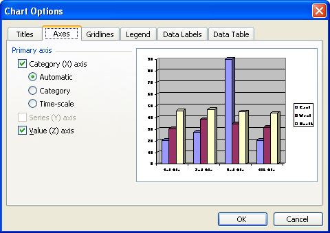
Figure 1. The Axes tab of the Chart Options dialog box
WordTips is your source for cost-effective Microsoft Word training. (Microsoft Word is the most popular word processing software in the world.) This tip (705) applies to Microsoft Word 97, 2000, 2002, and 2003.
Discover the Power of Microsoft Office This beginner-friendly guide reveals the expert tips and strategies you need to skyrocket your productivity and use Office 365 like a pro. Mastering software like Word, Excel, and PowerPoint is essential to be more efficient and advance your career. Simple lessons guide you through every step, providing the knowledge you need to get started. Check out Microsoft Office 365 For Beginners today!
Microsoft Graph provides a handy way to add simple charts to your document without the need for Excel. Those charts are ...
Discover MoreMicrosoft Chart uses a palette from which it pulls the colors it uses. Learn how to change the palette.
Discover MoreHow to remove information from your datasheet.
Discover MoreFREE SERVICE: Get tips like this every week in WordTips, a free productivity newsletter. Enter your address and click "Subscribe."
There are currently no comments for this tip. (Be the first to leave your comment—just use the simple form above!)
Got a version of Word that uses the menu interface (Word 97, Word 2000, Word 2002, or Word 2003)? This site is for you! If you use a later version of Word, visit our WordTips site focusing on the ribbon interface.
Visit the WordTips channel on YouTube

FREE SERVICE: Get tips like this every week in WordTips, a free productivity newsletter. Enter your address and click "Subscribe."
Copyright © 2026 Sharon Parq Associates, Inc.
Comments